
Loom
Dashboard + Navigation Redesign
Roles: UX/UI Design, Testing
Year: 2017

Background
One of the most rewarding parts of growing Loom was solving problems for the small community of people using the platform. Redesigning the Loom dashboard and navigation was one of my favorite projects, because it was a collaborative solution that not only resulted in an aesthetic upgrade, but solved multiple problems for our users.
Identifying problems
This project was sparked after reviewing our project database and seeing a lot of duplicate and abandoned project drafts. We interviewed employers on the platform to gather feedback. Through those feedback discussions, we also uncovered other problems caused by Loom’s navigation structure and dashboard experience.
Employers were abandoning project drafts because they couldn’t find them later in their dashboard.
Employers were missing relevant stats and available actions associated with their projects after being published.
The dashboard navigation structure was causing unnecessary friction because there was not a clear delineation between links meant for freelancers and links meant for employers.
The dashboard navigation was not easy to use on mobile devices due to an unclear side-scroll function.
Collaborative Solutions
Armed with clearly-defined problems, I met with my development team to ideate and sketch solutions. Working on a small team of 3 (1 designer and 2 developers) has taught me the value of bringing developers into the design process early and often. Designing solutions cross-functionally allows everyone on the team to feel ownership over the solutions and stay aligned on the work needing to be done.
During our sketching session we discussed ways to solve these problems, but aligned on two testable solutions to pursue:
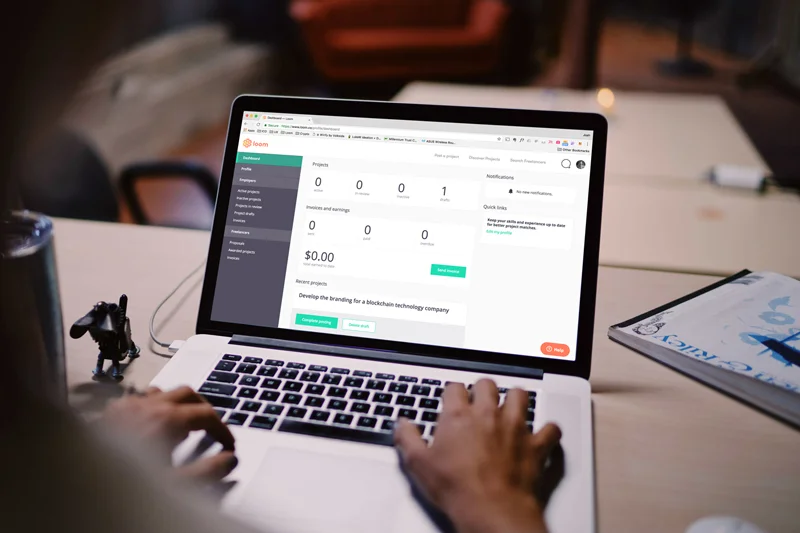
Update the dashboard to showcase and prioritize the most relevant and actionable information for each user.
Explore a side navigation that shows all available links and organizes them more clearly in employer and freelancer groups.
Don’t Reinvent the Wheel
With alignment from my team on the solutions we wanted to pursue, I decided first to tackle the side navigation part of the design. This portion of the design sprint moved quickly, as I was working from an existing set of links. I explored existing products that utilized side navigation patterns and was inspired by those with effective grouping, scalability and clarity in design. I used this research to inform my designs, developing a mobile-friendly navigation pattern that utilized clear groupings and color contrast to improve the navigation experience for Loom users.


After refining the navigation, I began designing the updated dashboard. The biggest question I needed to answer was "What information is most useful and actionable in the dashboard for both employers and freelancers?".
I regularly conducted research interviews with Loom users to understand how and why they use the platform, along with pain points and feature needs. Through that process, I gained a strong understanding of the key goals of both our employers and freelancers. The key goals of our employers are to publish a project, find and hire a freelancer, and easily pay them for their work. The key goals for our freelancers are to discover new projects, get hired, and get paid for their work.
I referred back to my research and compiled lists of relevant data to support the goals of both user groups:
Employers
Status of projects - drafts, in-review, published
Project stats - project views, new and total proposals
Notifications - latest proposals, messages and invoices
Status of invoices - new, paid and unpaid
Freelancers
Relevant project recommendations
Invoice status
Earnings
Notifications - messages, awarded jobs, paid invoices
Working from our existing style guide allowed me to move efficiently from whiteboard sketches to building high-fidelity designs. I met with my development team regularly for feedback as I refined designs for all dashboard pages and empty states. This process allowed us to collaboratively define user need states and the corresponding information each user should see based on their needs.


Build, Test, Launch
We were very confident about the improved experience for our users, so we opted to build a working prototype in our dev environment to test with select users. I worked closely with our front-end developer on the build. The feedback from user testing was positive so we released the update for all Loom users.

Results
Results were positive after the update. We saw a 100% decrease in support tickets regarding lost project drafts and have received positive feedback regarding the improved navigation and design of the dashboard.